Red – the colour of the vamp, the badge of royalty, the signal for danger. How many different moods and atmospheres can one colour provide?
An almost endless variation of shade means that this colour can be used anywhere and everywhere whether in wallpaper, fabrics or paint. But there is a caveat. For most homes, red at Its grandest and most vivid can be too much.
For this reason let’s look at the more manageable tones of red and the ways they can add power and impact to your design without dominating.
Firstly red can be broken up in a pattern, floral, geometric or striped. This means a second, calmer colour can be introduced to offset the vibrant red. Red can be teamed with gentle almond and linen tones.
Fabrics like Marine Coral by Thibaut show a red spiked coral motif against an off white background. Jim Thompson’s Design Turkaman achieves the same subtlety by invoking a diamond shape using both cream and green with the scarlet to add perspective.
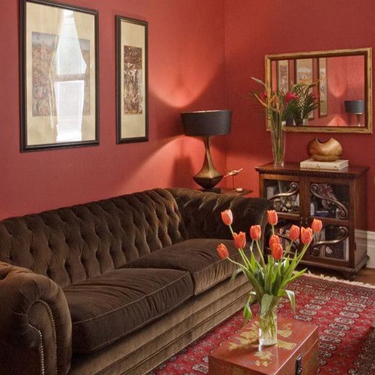
Painting a room red is a bold move but can be a great way to display artwork and other accessories that sit against it. Colours like Farrow and Ball Lake Red make a great back cloth to framed pictures and mirrors. To go darker and into a browner tone, Incarnadine is a powerful shade that looks amazing in evening lamplight.
Marry this with accessories in a contrasting orange or pink then your room will be dramatic and a statement.
Try scarlet, burgundy, vermillion, ruby, cherry and carmine – there will be a simply red to suit you.