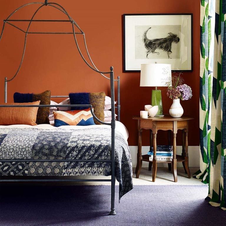
The bright warm tones of the Mediterranean can be seen in the strong earth tones of terracotta and ochre. These colours have not been used in recent years but they do form a useful function in today’s designs.
Looking afresh at terracotta, there are many ways of introducing this strong colour and using it to your advantage. Terracotta can add a sophistication to a study or boot room adding depth and vibrancy. These rooms are made interesting by the use of a dark colour and you can compliment it with accents of neutral tones so as not to be overpowering.
A good contrast to this colour would be a black in a lamp or the exact opposite in a cream skirting and woodwork which will emphasise the clarity of the dark orange. Another contrast would be to use a soft pink tone to punctuate the darkness.
In nature we see terracotta teamed with natural greenery in plant pots. Using this combination would give you a striking and fresh take on the colour.
Metallics also work well with this shade. A brass lamp or copper bowl look good against a painted wall.
This down to earth colour can bring heat and light into your house. Autumnal tones are for cosy and mellow effects.